powells.com redesign
UI CASE STUDY

objective
To create a responsive website that reflects the reputation of this large bookstore while providing the users with a better experience when browsing and purchasing books or specialty items.*
*This is a student project, I have no association with nor was I commissioned by Powell’s Books
context
Powells is a nationally-acclaimed independent bookstore, known all over the country. Their website is outdated and difficult to use. Users from all over the nation shop on this site, and struggle to efficiently find what they are looking for. Information is disorganized and doesn’t invite engagement with the site. Opportunities to promote new products and events are being lost.
1
Current Design
Scroll through the whole case study, or use these linked section numbers to jump around
2
3
4
5
User Stories
& Flows
Wireframes
UI Design
Final Designs
6
Before & After
current design


problem areas
Clickable text is very small
Issues with responsiveness/margins
Tiny text and form fields
Each version of the same book is a different entry
Feels outdated


goals for redesign
Responsive layout that is successful over 3 breakpoints
Improve Accessibility
Organize information to invite user engagement
Increase success rate of user’s completing tasks
Update design to more welcoming, modern UI
USER STORIES & FLOWS
These three user stories and their ‘flow’ through the website will help to guide the redesign process.

WIREFRAMES
Starting with sketches, then moving to mid-fidelity digital wireframes.


UI DESIGN
MOODBOARD
I created this moodboard to capture the urban and contemporary vibe, but also to capture the feeling of it being local and independent - definitely not a big box store. The color maintains the red of the Powells branding (which will not change), and introduces the blue as an additional color to help it feel more modern.

UI LIBRARY
Using my moodboard I created a palette of colors and selected fonts, as well as developing button styles, form fields, and icons. I also included reusable elements like pop-ups, drop down menus, and shopping functions.

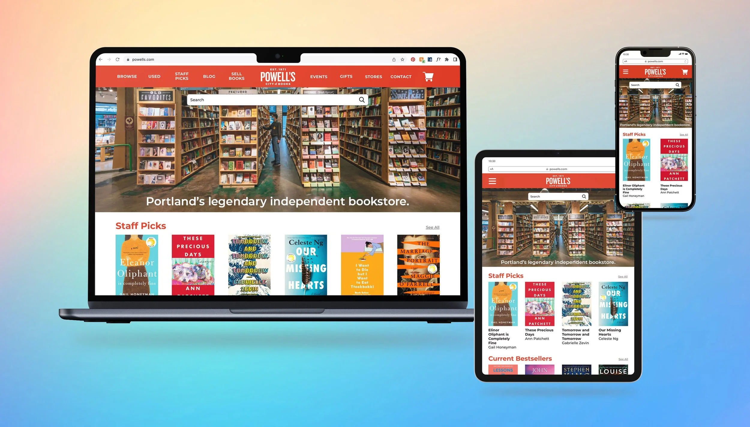
FINAL DESIGNS
Mockups of the high-fidelity designs along with a clickable prototype.


Interact with the prototype!
BEFORE & AFTER
A before & after comparison between the three main screens which would begin each flow.


next steps
I would like to continue to iterate on my designs, create responsive layouts for more screens, and develop more interactions for the user (i.e., set up account, shop for gifts, store locator).
User testing was not a part of this assignment, but it will be an important next step in improving the design and gaining more feedback from real-world Powells.com customers.
Thank you for taking the time to look at my case study!